HI stencil typography on gradient waves
Tags
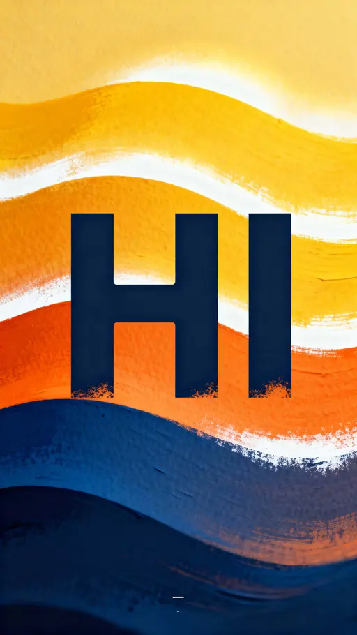
A bold stencil letterform reading "HI" occupies the central vertical plane of a 9:16 composition, presented as a confident display headline with poster-scale impact and studio presentation intent. The letters are quoted as "HI" and rendered with crisp negative cutaways, scaled to fill roughly one third to half of the frame height and aligned to center with even letterspacing for strong legibility. The background is a series of flowing gradient wave bands that graduate from deep cobalt #0B3D91 through warm orange #F15A24 to bright warm yellow #F8E71C with white #FFFFFF highlights, creating a gently glowing layered field that frames the type. Surfaces read as painted paper with subtle grain and occasional sprayed-edge texture on the stencil edges to imply tactile stencil application. The primary focus is the letter edges, which resolve sharply in the foreground while the wave bands sit at a moderate soft separation to suggest depth. Lighting is even with a soft directional glow that sculpts the wave ridges and gives the colored bands a warm bias. Framing is a tight vertical crop at a 9:16 aspect ratio with clear top and bottom margins, centered composition, and balanced negative space above and below the headline for mobile and poster crops. A single small alignment mark or registration sticker near the lower corner serves as a pragmatic studio cue. The style reads as clean vector illustration combined with tactile painted texture, suitable for poster, social-story, or mobile display uses. Subtle motion is implied by the curvature of the waves, giving a gentle left-to-right drift without blur.